These 7 logos range from one-ink black and white to silver 3D numerals on black, and the cost of printing is the clearest dividing line between them.
Where the logo will live decides the pick: a dark invitation calls for the 3D Silver ’25’, a plain white card suits the Silver Glitter Splash Accent or the Modern Parallel Line Typography, and a business anniversary fits the Brushstroke Banner Base or the Ornate Monogram Flourish.
Guests who read more than one language point to the Bilingual Script with Leaf Accent.
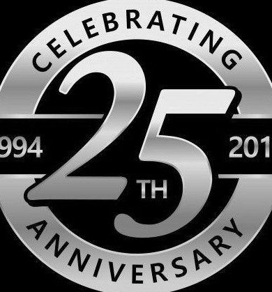
1. 3D Silver ’25’
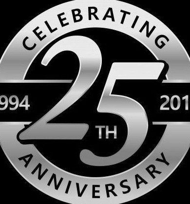
A silver 3D "25TH" on black reads as formal and expensive, and the contrast does most of the work.
Keep the background dark and let the numerals carry the highlights, because a glossy silver number on a pale ground loses its edges.
Putting both years inside the circular emblem gives you a ready-made sticker, cake topper or napkin stamp. Pick one circle size and reuse it everywhere so the pieces match.
2. Bold Number with Ribbon Banner
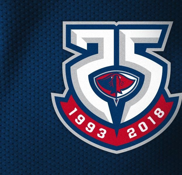
Red against blue is the strongest move here, and the ribbon banner is where it happens. Set the years, 1993 and 2018, on the ribbon so the dates stay readable even when the logo shrinks to a favicon or a cupcake flag.
I would keep the number itself to white and blue only. That leaves the red ribbon as the single warm accent, and it draws the eye straight to the milestone span.
3. Silver Glitter Splash Accent
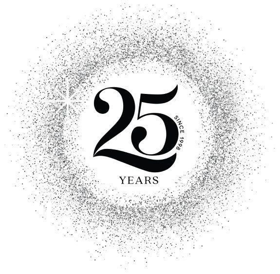
Black numerals with a circular spray of silver glitter give you a clean logo that still has some motion in it.
Because "SINCE 1998" and "YEARS" sit with the 25, keep that text small and plain so the splash stays the only loud element.
White backgrounds suit this best, since printing it on a dark invitation would swallow the black number. For a handmade version, a real glitter spray stenciled around a cut-out number gets the same look on a banner.
4. Modern Parallel Line Typography
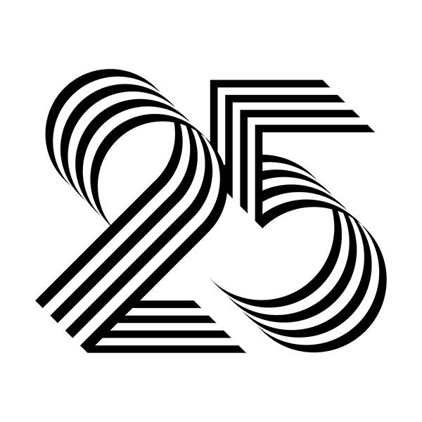
Flowing parallel lines turn the anniversary number into something that looks drawn in motion, and it needs nothing but black and white. That makes it the cheapest logo to print: one ink, any paper, no color matching.
I like it best large and alone on a plain white ground. Adding text or a border would crowd the lines, which are the whole design.
5. Bilingual Script with Leaf Accent

Pairing Bengali script, "রজত জয়ন্তী বর্ষ", with "Celebrating 25 Years" in English lets one logo speak to every guest in the room. Gold and black on cream keeps both scripts legible, and the leaf branch fills the empty space without touching the letters.
Give each language equal size so neither reads as a translation. If your guests use other languages, swap the second line and keep the same gold-and-black treatment.
6. Brushstroke Banner Base
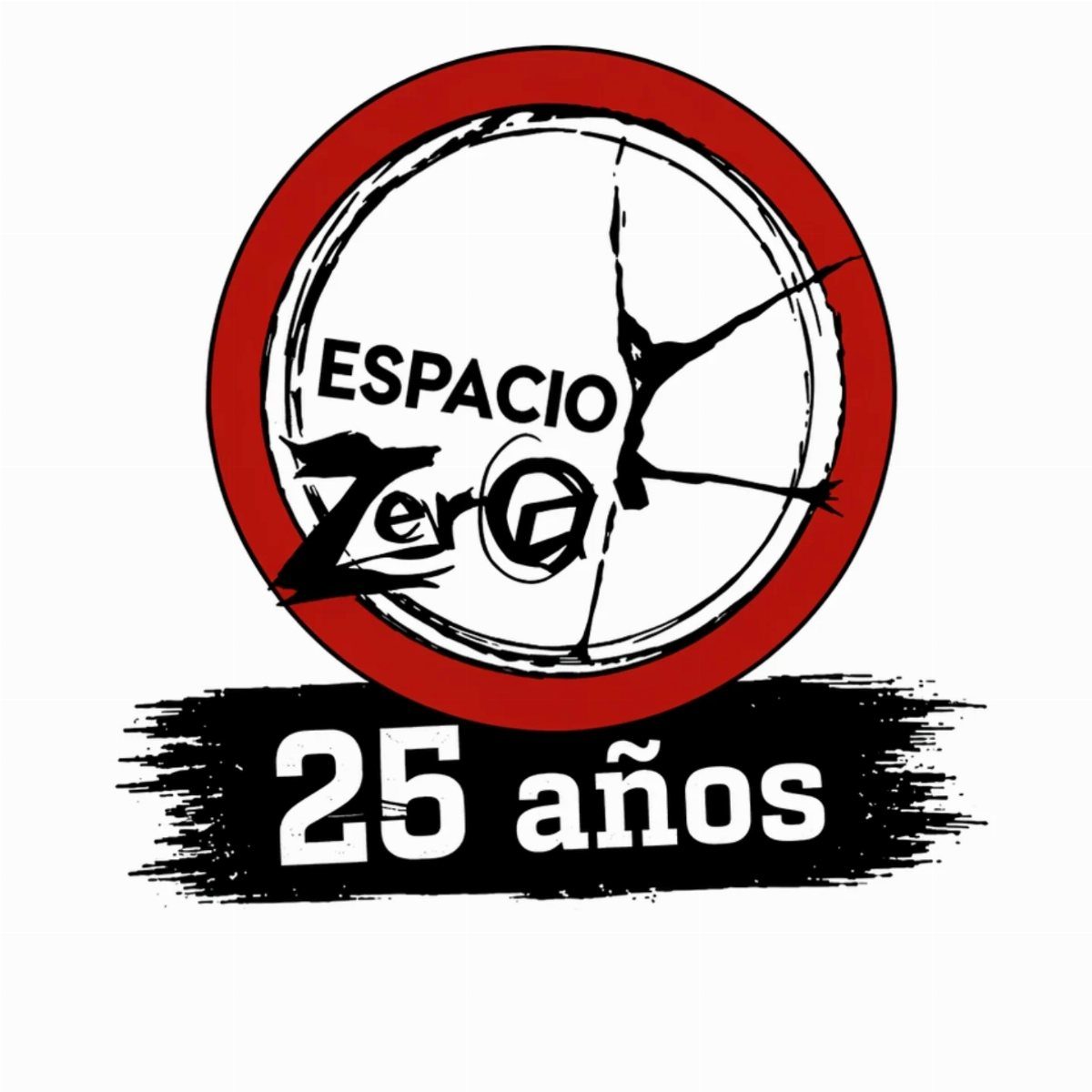
A red circle holding the name and a silhouette sits above a black brushstroke banner reading "25 años", and that stacked layout suits a business better than a party.
The name stays on top, while the milestone lives on the banner in white.
Rough brush edges soften an otherwise tidy emblem, so I would keep the banner wider than the circle. Swap "25 años" for your own language and the structure works unchanged.
7. Ornate Monogram Flourish
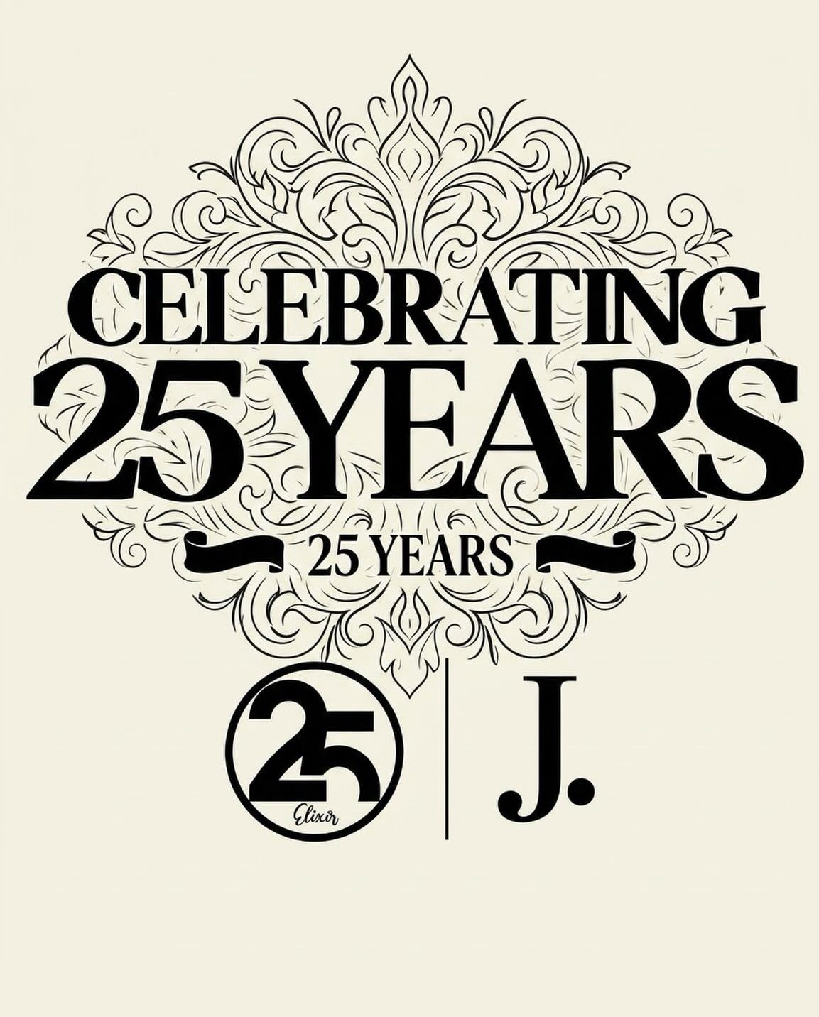
Black ink on white, framed by vintage flourishes, gives this logo an engraved, old-letterhead feel.
Put the "25 Years" line inside the flourished frame and keep the emblem simple: a single initial, like a "J", paired with the number 25 in a circle.
Because it uses one color, it prints cleanly on plain paper, which makes it a good fit for a formal dinner or a business anniversary.
Keep the emblem as its own small file so it can stand alone on a favor tag or a cake flag.
The flourishes are fine lines and fade when shrunk, so use the full version only at card size or larger.
Frequently Asked Questions
What is a 25 year wedding anniversary called?
The 25th wedding anniversary is called the Silver Anniversary. Silver is also an easy color for a logo: a glossy silver 3D "25TH" on a black background looks formal, and keeping the ground dark lets the numerals hold their highlights.
What do you say for 25 years?
Call it the Silver Anniversary, or simply write "Celebrating 25 Years" on your signage and cards.
For a bilingual crowd, set both lines in the same type size so neither looks like a footnote to the other, and choose the second language to match who will actually be reading it.